Graph Presentation Quality 3
Improving Graph Quality: Graphical Presentation
More graphs
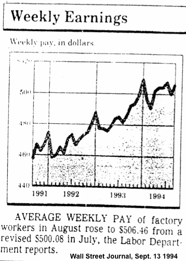
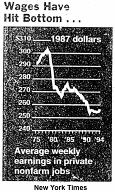
These graphs show average earnings in the United States during overlapping periods of time. Why does one graph show an upward trend and the other graph show a downward trend? Observe at the upper right in the graph from the New York Times, the reference to 1987 dollars. This means the figures were adjusted for inflation, which was substantial during that period. Which graph do you think is more meaningful for the individual earner? Think about how this example might stimulate better graphical practices to express the meaning of the results plotted.
The following links were accessible within the University of Wisconsin College of Engineering as proprietary material for instructional purposes. They are removed because Computer Aided Engineering (CAE) has shut down the server so it evaporated as of summer 2021. The service had been available for many years but it has been taken away.
Top
Improvement of graph presentation quality main page