Graph Presentation Quality 2
Abominable Graphs page 1
More graphical woe: case studies how not to do it.
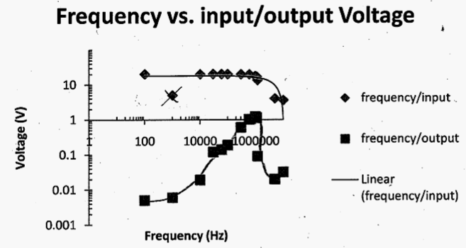
This graph is problematical
since the horizontal log scale has cycles of a factor of 100, but the divisions are based on a factor of 10. Such a blatant mathematical inconsistency is, to say the least, distracting to the reader. The title should be voltage vs. frequency, not the other way around. The labels are similarly reversed. The label "linear" is not appropriate since linearity was not tested.
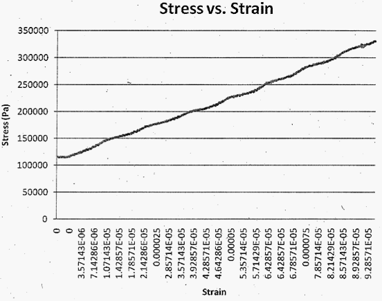
This graph has particularly ludicrous FORTRAN notation on the horizontal scale. The densely packed numbers are rotated so that the reader has to exert extra strain to attempt to read the FORTRAN. The two zeroes at the left of the scale, presumably due to round-off, are distracting and painful. Use of six "significant" digits is distracting and painful. Switching between FORTRAN and normal text is an added distraction.
The vertical axis would benefit from use of units kPa to reduce the number of zeroes.
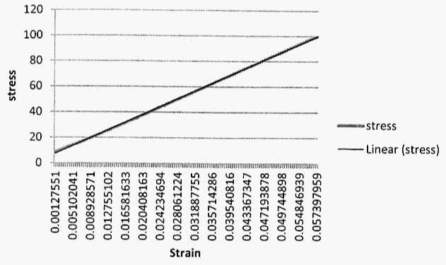
This graph has far too many digits in the scale labels on the horizontal scale. The densely packed numbers are rotated so that the reader has to exert extra strain to attempt to read it and interpret it. There is no distinction between major and minor scale markers, and the markers given are too closely spaced. Stress, on the vertical scale, cannot be interpreted without units.
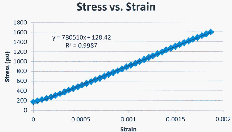
This graph from the same sort of data as the prior one, is nicely done. The offset in stress is due to a preload.
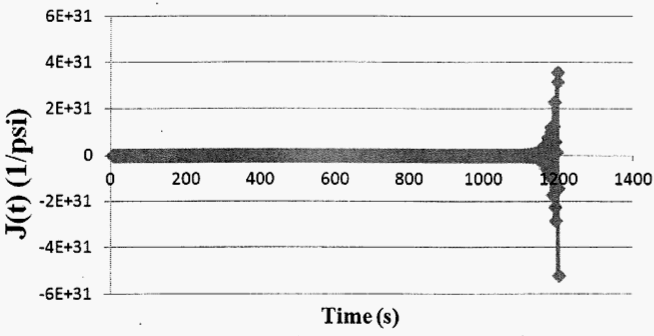
In addition to crude FORTRAN notation, the results are off by a factor of about 1030; by contrast, a million is only 106. To avoid such embarrassment, it is sensible to check one's results to eliminate giant errors that should be easily recognized.
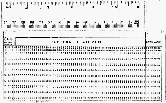
This is an image of computer card, with a ruler to show the scale. These cards were used to record FORTRAN statements by punched holes to be made in the card; one short line of text per card. The program was recorded on a stack of these cards, submitted to a central computer for batch processing, and retrieved the next day. In 1965 a mainframe computer such as the IBM 360 and its ancillary devices filled most of a room; there was no computer graphical interface. Even so, published articles and books did not use the crude FORTRAN notation. Instead, because humans rather than computers are the audience, proper scientific notation was used. Some software writers today have lost sight of the fact that humans read reports, articles, and books, hence the software writers exacerbate the proliferation of abominable graphs, tables, and description of numbers. Rather than FORTRAN type notation 5.00E-05, use scientific notation (5 x 10⁻⁵) or Greek prefixes such as k for kilo, M for mega, n for nano, p for pico.
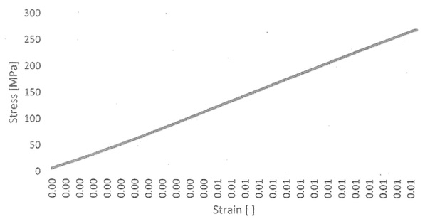
How could one possibly judge the strain from this graph?
Top
Improvement of graph presentation quality main page
Improvement of graph presentation quality page 3